In this blog post, we’re going to geek out about button accessibility! We will discuss requirements for button accessibility, proper button usage (hint: they’re not synonymous with links), and go over some fun buttons that I designed to prove button designs can simultaneously be fun and accessible. Enjoy!
A General Review on Button Accessibility
As a general best practice, people should be able to tell what is actionable simply by looking at it, before any type of interaction (such as hovering over it). In other words, button’s contrast from the background should effectively signify to the user that it is interactive, and any hover effect should support that. An accessible button will meet the standard text and color contrast requirements, have a reasonable target size, a hover point indicator, and clear yet effective labeling.
Button Accessibility Color & Text Requirements
When adding a button to your website, you likely already know about color contrast requirements. However, as a quick reminder: to ensure accessibility for individuals with vision impairments, the contrast ratio between the text color and button background color must be at least 4.5:1. This helps ensure the button is easily readable by all users, and easy to find on the page.
As a refresher, buttons also must follow WCAG guidelines for text spacing, which indicates that the website functionality must not change if best text spacing practices are followed. Users with visual or cognitive impairments may struggle to read your content if it doesn’t meet the following criteria:
- Line height (line spacing) to at least 1.5 times the font size;
- Spacing following paragraphs to at least 2 times the font size;
- Letter spacing (tracking) to at least 0.12 times the font size;
- Word spacing to at least 0.16 times the font size.
It is also advisable to use easy-to-read text for buttons so users can understand the action they are taking with the button. Now that we’ve reviewed some of the design basics, we will move onto interaction design aspects that make a button accessible.
Interactions – Target size
Many people with physical disabilities have a difficult time activating small buttons, and if buttons are too close together, they may have a difficult time activating the right button. Can you imagine filling out a huge form online, only to accidentally hit the cancel button, instead of the submit button? That would be extremely frustrating.
Because of this, W3 generally recommends setting a minimum target size (aka – the size of the area the user has to click to activate the button) of a button to 24px by 24px, which advising that best practice is a minimum of 44px by 44px.
However, many designers advise going a little bit larger, especially for mobile. Google recommends going 48dp for their Android devices, and setting a minimum of 8dp for spacing.
Clear and Effective Labeling
When a screen reader reads the text on a screen to a user, and it reads a vague label, it can be very confusing and frustrating for the user. A clear label, and correct aria label use will help the user get exactly where they want to be.
Using a clear label in the HTML for your button/website can clarify to users where this button will take them. Whenever possible, it is best to use <label> tags to explicitly state the purpose of what the user is interacting with, but W3 has published some appropriate ARIA workarounds for when this is not possible.
Like the label, the button text should be clear, specific and descriptive to avoid confusion. R
For example, if we use two different buttons that says “Read More” to link to two different areas, it will be very unhelpful. A better alternative would be “Read more about (subject)” or “(subject) details”.
Button Visual Consistency
WCAG has success criterion for consistent element designs because some users rely on their ability to recognize elements on the page that they’ve already identified and interacted with. In general, it is also a good design practice to keep your button styles consistent. A simple way to apply this is to not change up your button styles too much. It is okay to have a ghost button for secondary actions (think of “cancel” buttons as opposed to “submit” buttons).
A ghost button is a button with no background color, but a defined border that usually matches the text color of the button.
WCAG 2.2 Compliant Button Functionality
In order for buttons to function in a way that is accessible, they need to be operable both through a mouse and a keyword, have a consistent role, and consistent button functionality.
Button Operability
In order for buttons to be inclusive for people who prefer to navigate using a keyboard, it has to usable with a keyboard. Typically, a user will do this using the tab button to navigate through the page, and either “spacebar” or “enter” to active that button action after it has been selected.
The native HTML buttons will have this built-in, but if you create a custom element, or utilize a <div> to function like a button, you will need to add some code in order to meet WCAG operability standard. The accessibility department of Harvard University has a quick, easy tutorial to accomplish this.
Consistent Button Roles & Functionality
A button role is a type of aria label that tells screen readers the type of element that is before them.
It is unhelpful and frustrating if aria labels are used inconsistently. For example if a label for a button in the corner of a program says “Save Changes” and the Save button on the menu page says “Update Progress,” it is going to be confusing for the user that relies on those labels. It is best to be consistent with labels.
Sorry, Buttons are for Actions (not relocating the user)
Accessibility resources, such as W3, assert that buttons are not for navigation (with the exception of the navigation menu), but rather to complete a functional action and that everything associated with navigation should be accomplished via links.
Here are a few examples of popular actions that buttons are used to accomplish:
- Submit
- Open
- Cancel
- Delete
- Toggle
- Mute/Unmute
- Lightmode/Darkmode
This is just a quick overview and summary of WCAG 2.2 guidelines for buttons. These may feel like a lot, but they’re make a huge difference to the quality of the user’s experience. Discussions around accessibility are often centered on rules that can feel restrictive and dull, but I promise that these guidelines do not limit creative potential to make a fun and beautiful website.
In this next section, we will discuss and showcase examples of really fun/creative and accessible button designs.
Getting Creative with Accessible Buttons
Before we continue, I want to specifically state that I designed these buttons and am using them as visual examples. These were created with design/prototyping tools, so they are not utilizing proper labeling techniques. When creating buttons online, please utilize proper labeling techniques to ensure compliance.
- Have fun with button content

If you’re ready to think outside the box (yes, that pun is intended), then consider unique button content that creates opportunities for animations.
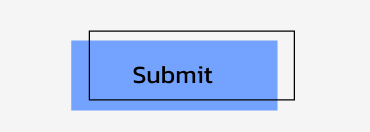
- Get creative with borders

Offsetting a border is a fun way to and layers and depth to a button. When you look at it, it is clearly interactive!
- Box shadows are your friend

Staying on theme with button depth, box shadows make buttons look like they are floating on the page.
- Don’t Forget About Gradients

Does anyone else remember when gradients became popular, and suddenly they were being used almost too much? One fun way to use gradients in a more subtle way is to use them in buttons! Just make sure your button text meets contrast requirements for both end point colors of the gradient.
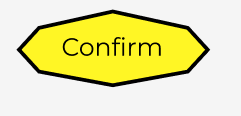
- It’s okay to get a little experimental with button shapes

Generally, it is best practice to keep buttons as rectangles, but sometimes unique branding brings opportunities to get a little experimental. If you get really experimental, it may be worth some user testing to confirm people still recognize it as a button. This is a great time to make sure your user testing group includes differently abled people.
- Don’t forget about icons

Button icons are very underutilized, and I get why – they’re definitely not the right choice for all button contexts. However, if you have a really simple favicon or logo variation, it could be a fun opportunity to add it to the buttons. I just advise being careful to ensure button consistency when it comes to button icons – as consistency is an important part of WCAG 2.2 compliance.
By designing buttons with accessibility in mind, you’re not only improving user experience but also creating a more inclusive digital space. The examples we’ve discussed show how simple adjustments—like choosing the right contrast and using clear labels—can make a big difference. As you design your website, keep accessibility at the forefront, and remember that a well-crafted button is one that everyone can use with ease. Let’s make the web a place where no one is left behind!