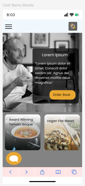
The Bento Box Information Architecture and UI layouts have cycled in and out of popularity over the last 20 years, heralded as a great choice for interactive/image based layouts that gives the user access to a lot of information on their screen. However, when it comes to mobile devices, the need to prioritize information and be considerate of spacing becomes even more important.
In this blog, we’ll explore how to design effective mobile layouts using Bento Box information architecture.
What is Bento Box Information Architecture?
Bento Box Information Architecture is inspired by the Japanese bento box—a neatly packed meal where every item has its own defined compartment. Similarly, in this approach to digital design, information is broken down into individual components or “boxes” that are easy to view and navigate. Each box represents a distinct content area or function, making it easy for users to locate what they need without getting overwhelmed by clutter.
When applied to mobile design, Bento Box architecture aims to:
– Present content in small, digestible pieces.
– Maintain a clear visual hierarchy.
– Keep navigation simple and intuitive.
– Support responsive design principles that adjust to various screen sizes.
The Core Benefits of Bento Box Layouts in Mobile Design
1. Improved Usability
One of the main challenges in mobile design is maintaining usability on small screens. Bento Box layouts allow users to see all available options at a glance, allowing the user to intuitively select their next destination in the page. Users can quickly identify key functions or content areas and dive deeper into the ones that interest them.
2. Flexibility and Scalability
The compartmentalized structure of Bento Boxes makes the design inherently flexible. You can easily add, remove, or update individual content boxes without overhauling the entire design. This is particularly beneficial for mobile apps and websites that frequently update content.
3. Enhanced Focus on Content
By breaking content into smaller, focused sections, Bento Box design helps eliminate distractions and ensures that each piece of content receives the attention it deserves. This clear structure encourages users to interact more deeply with individual features or information.
Best Practices for Designing Mobile Layouts with Bento Box Architecture
1. Prioritize Key Content
On mobile devices, screen real estate is limited, so it’s important to prioritize the most critical content or actions at the top. Each Bento Box should represent a core function or section of your app or website. Whether it’s a navigation menu, featured content, or key actions (e.g., “Shop Now” or “Contact Us”), ensure that users can access these essentials quickly.
In situations where preview text may be displayed, consider reducing the amount of characters that are showing in addition to scaling down the amount of content.
2. Maintain Consistency in Design
While the boxes are compartmentalized, the overall design still needs to feel cohesive. Use consistent colors, fonts, and iconography across all boxes to unify the design. This helps users feel more comfortable navigating between sections, as they won’t have to adjust to a radically different style in each box.
3. Prioritize Tap Targets
Given the smaller screen size of mobile devices, it’s crucial that each bento box is designed with user interaction in mind. Ensure tap targets (buttons, links, etc.) are large enough to be easily tapped without accidental clicks. Adhering to mobile-friendly design principles, such as a minimum target size of 44px by 44px, will help reduce user frustration and improve the overall experience.
4. Focus on Accessibility
An often-overlooked aspect of mobile design is accessibility. Ensure that your Bento Box layout is inclusive by using clear labels, sufficient color contrast, and scalable fonts. Additionally, optimize the design for screen readers by using proper semantic HTML and ARIA labels where needed.
Examples of Bento Box Design in Mobile Layouts
1. Media Apps
Many streaming services, like Netflix and Hulu, use a variation of the Bento Box design by organizing content into scrollable rows. Each row (or box) represents a specific category, making it easy for users to navigate through vast amounts of content.
2. E-commerce Platforms
E-commerce websites often adopt Bento Box layouts to showcase product categories, promotions, and recommended items. Each box features a distinct set of content that leads to a specific action, such as viewing a product or making a purchase.
3. News and Blog Platforms
News websites and blogs also benefit from Bento Box architecture, especially when offering diverse content types. By breaking articles into boxes labeled by category or popularity, users can quickly navigate to stories that interest them without wading through irrelevant information.
Designing mobile layouts with Bento Box Information Architecture is a powerful way to improve usability, focus, and content accessibility. This structure helps you deliver a streamlined user experience while maintaining flexibility and scalability. By focusing on intuitive navigation, prioritizing key content, and ensuring consistent design, you can create mobile experiences that engage users and make it easier for them to interact with your brand.
As an example of this, I made a bento box design of my own mobile following these principals. As you can see, I prioritized important content and scaled back the content that was lower priority. I also kept all tap targets were at minimum size and maintained consistency.
As mobile usage continues to grow, adopting this design strategy will keep your mobile presence competitive and user-friendly.
